5 hot packaging design trends in 2024
Pentawards expects to see layers, rock textures and moving parts.
Packaging design is one of the areas in which changing trends are most keenly felt. As we approach the end of the first month of 2024, the awards body Pentawards has released its annual report picking out the packaging design trends of 2024, and there are some intriguing predictions.
1. Moving part
The report identifies an increasingly imaginative use of paper packaging “adding value to the unboxing experience” while also providing a more environmentally conscious way of delivering products and sharing key product information.
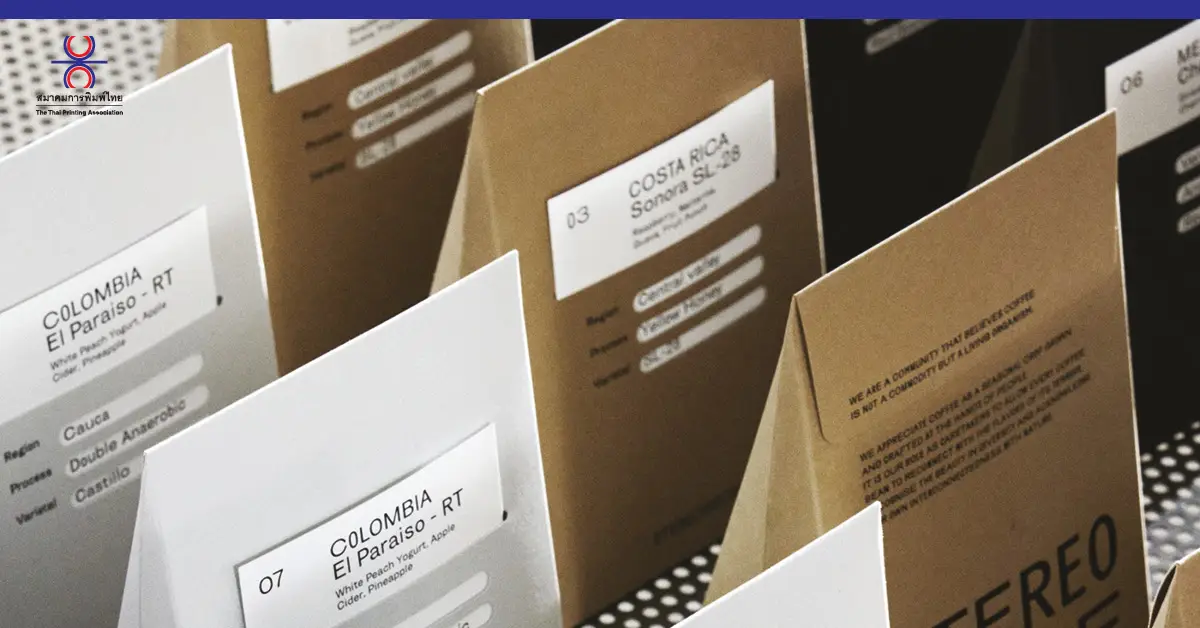
As an example, Pentawards highlights Stereoscope’s coffee collection. Design studio Olssøn Barbieri created boxes with pyramid-like shapes that resemble mountains, representing the high altitudes where Coffee Arabica is grown. The boxes can be easily interlocked for shipping, and the brand’s ‘2-pack’ subscription box has a leaning prism shape to optimise space. A glue-free card system for labeling different coffee variations further improves sustainability.
2. Shadow play
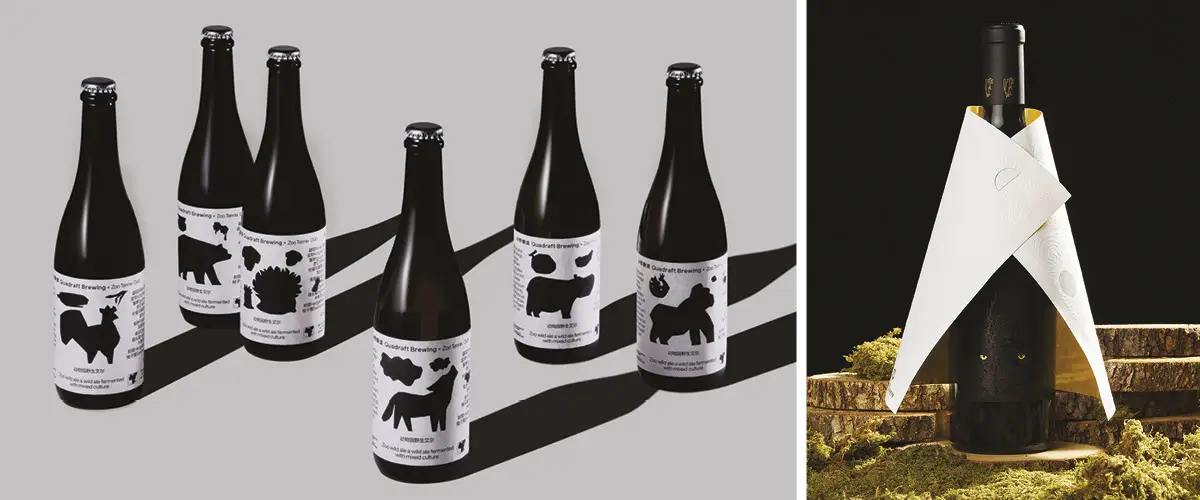
The report also picked out examples of shadows and silhouettes being used to convey themes, stories and brand values in a bold but minimalist way. Quadraft Brewing’s Zoo wild ale packaging design uses rough animal silhouettes against a black-and-white palette for a fresh visual system that reflects its personality.
3. Subtle details
In drinks packaging, the Pentawards jury noted brands use subtle details to evoke a character or narrative around their products. It highlighted the packaging for Ca’ del Bosco’s Carmenero: Rivelazione wine uses the concept of a wolf in lamb’s clothing to assert the identity of a wine long confused with Cabernet Franc. A blind embossed cloak adorned with a stamped gold interior symbolizes the lamb ‘disguise’. When it’s lifted, the hidden wolf underneath, with a stamped gold gaze set against forest foliage.
4. Rock textures
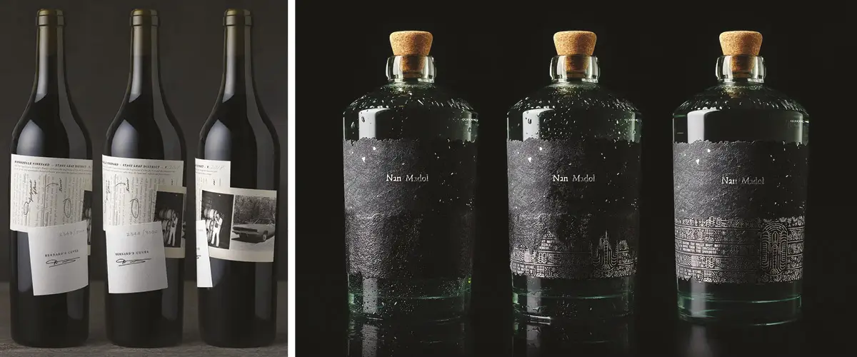
The 2023 Pentawards entries also included several examples of brands and studios incorporating rock and earth-like textures in packaging design, which adds visual and tactile richness while conveying a sense of natural origins. Estudio Maba’s design for Nan Madol’s vodka bottle evokes the effect of water on rock, with the lower half of the label making it look like the bottle is semi-submerged. When placed in an ice bucket, the top layer of blackened paper disappears to reveal symbols telling the story of Nan Madol, an ancient city comprising artificial islands in Micronesia.
5. Layering
Finally, another of the trends identified is layering, which Pentawards says provides a metaphor in packaging, inviting consumers to uncover stories, histories, and messages. Clos du Val Bernard’s Cuvée uses layers to create a collage exploring the winery’s journey and iconic moments in three layers of historical artifacts.

